Pecunity
UX/UI | App Development | Brand Mark Design
Overview
I was hired to design an app for a local startup in Denver that is setting out to change the landscape of digital currency. During our initial meeting, they drew out a rudimentary user flow to show me what features they wanted to display in the mockups and told me that they wanted to have a similar color palette to what they saw in the Responciv project on my portfolio. Aside from these two directions, they let me have free rein over the design and the structure of the app.
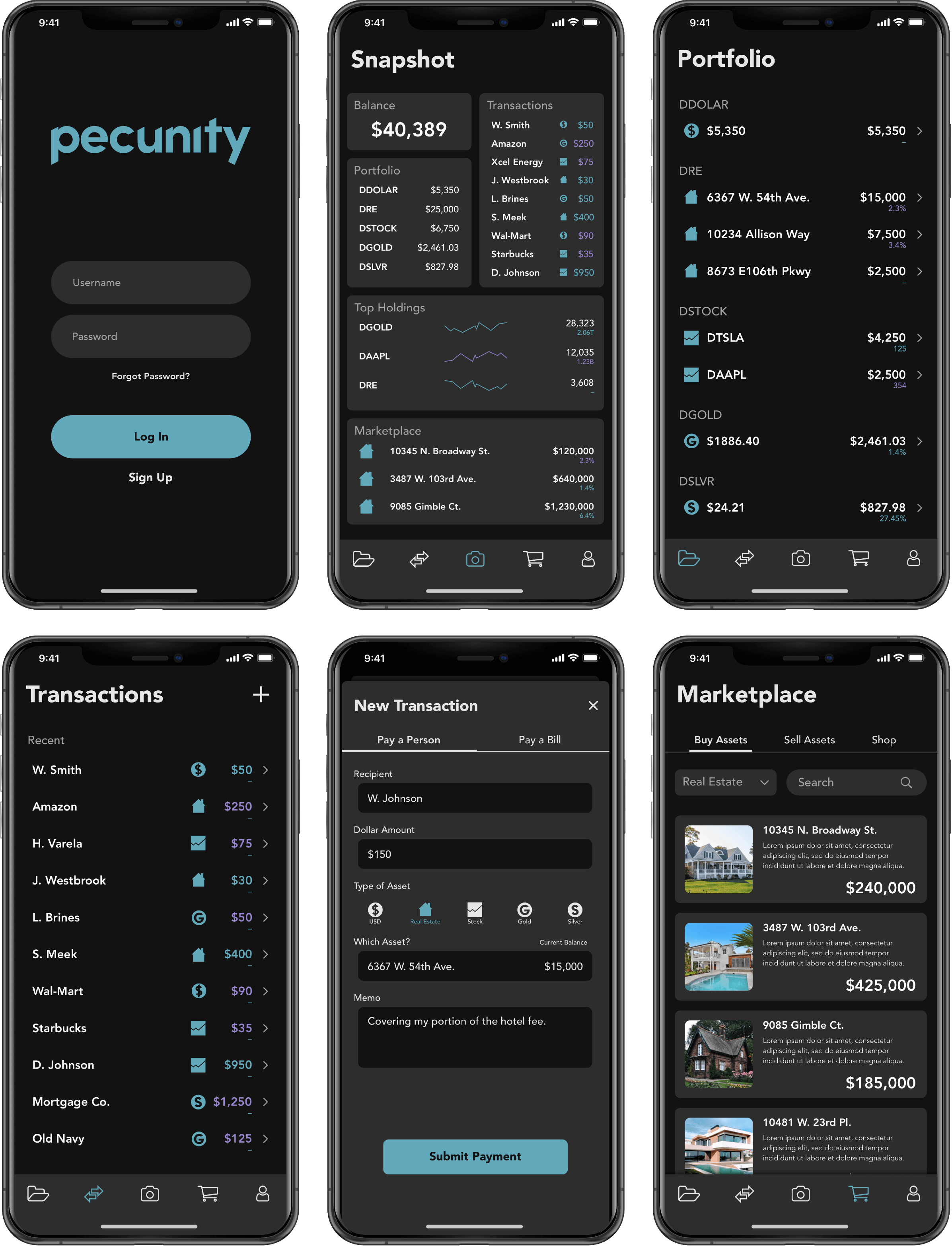
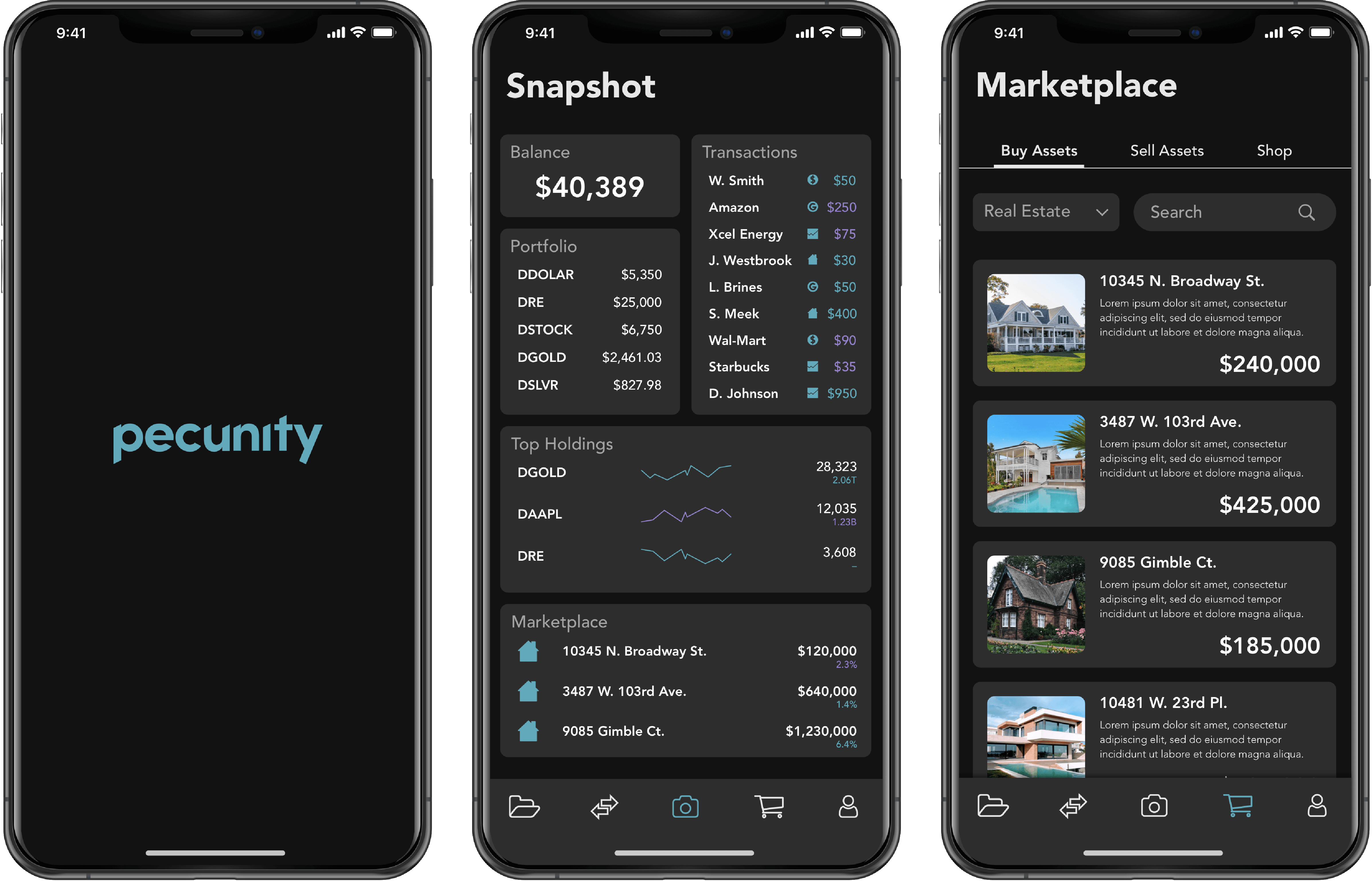
Since the app will be monitoring so many different investments and accounts, I thought it would be most effective to have a dashboard for the main screen so that the user could see a quick snapshot of their portfolio when they opened the app. From there, they would be able to navigate through the bar on the bottom or by clicking the different modules in the dashboard. I used icons to help differentiate between the many types of assets that will be featured in the app so the user can quickly and easily recognize which type they are seeing. I followed Human Interface guidelines to the best of my knowledge because I was designing the comps on an iPhone mockup.
I designed the brand mark to be a contemporary and professional representation of their product.
UI Comps